
Explore the Intelligence Behind Your Revenue
Gain deeper visibility into your revenue cycle with data-driven insights that uncover opportunities, reduce inefficiencies, and help your organization make smarter financial decisions.
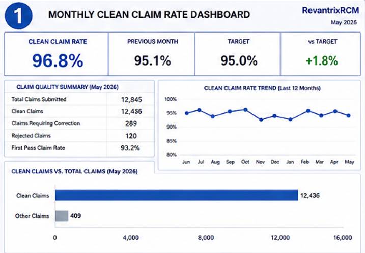
Monthly Clean Claim Rate Dashboard
What this dashboard communicates
This dashboard is your practice’s “claim health report card.” It focuses on how efficiently you are submitting claims that are accepted on the first attempt without errors or rejections. The centerpiece is the “Clean Claim Rate,” showing your practice at an impressive 96.8% for May 2026, which is an improvement from the previous month. This view is designed to help you quickly assess the effectiveness of your front-office data entry and coding practices, showing a 12-month trend for long-term tracking and a summary of claim quality, including the volume of clean claims, rejected claims, and claims requiring correction.
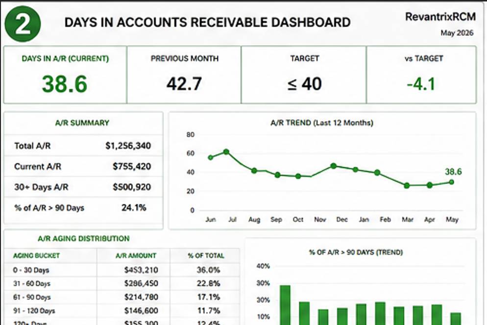
Days in Accounts Receivable Dashboard
What this dashboard communicates
This dashboard provides a clear look at your practice’s aging receivable and how effectively you are getting paid for the services provided. The central KPI is “Days in A/R (Current),” which tracks the average number of days it takes for a claim to be paid from the date of service. In this view, your practice is on track, showing a positive trend. This dashboard helps you identify where revenue is sitting by providing a detailed “A/R Aging Distribution,” breaking down total A/R into categories of 0-30 days, 31-60 days, and so on. You can also track the percentage of A/R that is over 90 days, giving you immediate insight into old, unpaid balances that need attention.
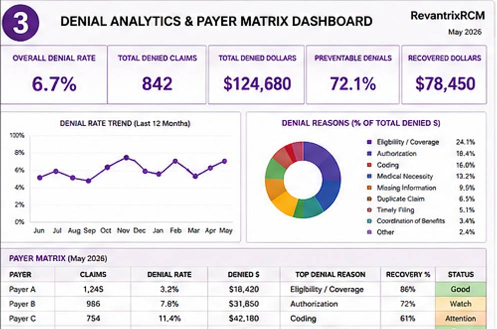
Denial Analytics & Payer Matrix Dashboard
What this dashboard communicates
This detailed view gives you a direct, unblinking look at claim denials and the specific payers causing them. The dashboard displays overall denial KPIs, including the “Overall Denial Rate” and “Total Denied Dollars” for the month. To get to the root of the issue, the dashboard uses a donut chart to break down “Denial Reasons” (e.g., Eligibility/Coverage, Authorization issues, or Coding). Additionally, it features a visual “Payer Matrix,” allowing you to compare the performance of different payer groups (e.g., Payer A vs. Payer E) by listing the volume of claims, denial rates, denied dollars, and even top denial reasons for each payer.
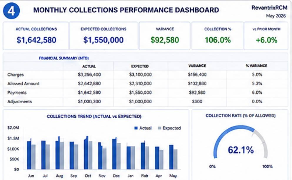
Monthly Collections Performance Dashboard
What this dashboard communicates
Here, the primary focus is on how well your practice is collecting on its billed services. This dashboard offers a sophisticated view, starting with a direct comparison of “Actual Collections” versus your “Expected Collections” for the month, revealing any variance. It includes a comprehensive “Financial Summary” table that breaks down total charges, allowed amounts, and payments, along with performance percentages against targets. Physicians can review long-term progress via the “Collections Trend (Actual vs Expected)” bar chart and quickly check the critical “Collection Rate (% of Allowed)” to ensure you are capturing your contracted reimbursement..
Patient Responsibility Dashboard
What this dashboard communicates
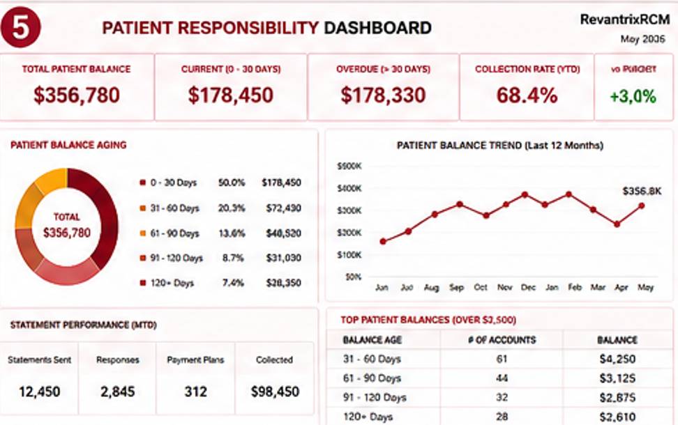
Designed to track the portion of revenue owed directly by your patients, this dashboard helps you manage and reduce outstanding patient balances. It lists “Total Patient Balance” and provides an instant breakdown of “Current (0-30 days)” versus “Overdue (>30 days)” balances. The dashboard uses an “Aging” donut chart for a clear visualization of patient debt by bucket (e.g., 91-120 days overdue). It also tracks “Statement Performance,” showing the volume of statements sent versus collected, and lists a critical table of “Top Patient Balances (Over $2,500),” letting you know precisely which accounts have the largest outstanding debts.
CPT / Procedure Revenue Dashboard
What this dashboard communicates
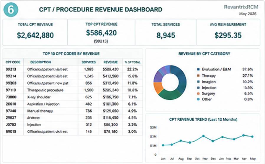
This dashboard allows you to analyze and understand exactly where your practice’s revenue is coming from at the procedural level. It tracks “Total CPT Revenue,” “Top CPT Revenue,” and critical efficiency metrics like “Avg Reimbursement” per service. It features a specific “Top 10 CPT Codes by Revenue” table, showing which specific procedures are your primary drivers of income. It uses a donut chart to visualize “Revenue by CPT Category” (e.g., Evaluation & Management, Surgery, or Injection), allowing you to understand the balance and focus of your practice’s clinical activities.
Daily Physician Performance Dashboard
What this dashboard communicates
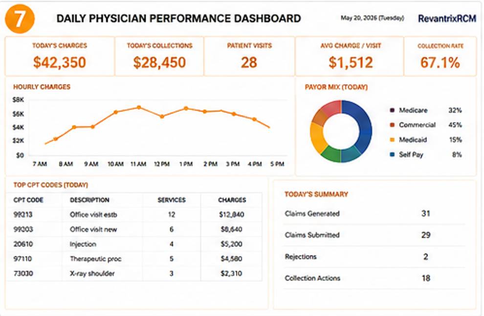
Built as a direct, real-time snapshot of your individual clinical day, this dashboard gives you an easy way to track your progress and patient flow. Key “Today’s” metrics, such as total charges, collections, and patient visits, are listed at the top. The dashboard includes an “Hourly Charges” trend to show you the tempo of your day. A “Payor Mix (Today)” chart breaks down your patient types (e.g., Medicare, Commercial, Medicaid), while a specific list of your “Top CPT Codes (Today)” shows you which services you performed most. This provides you with an easy, immediate view of your daily work and its impact on the practice.
Weekly RCM Activity Dashboard
What this dashboard communicates
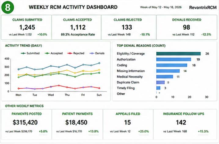
Designed as a summary of the heavy-lifting revenue cycle work performed by your billing team, this dashboard focuses on operational efficiency on a weekly basis. It tracks key volume and throughput metrics, including total claims “Submitted” and “Accepted” versus those “Rejected,” providing you with acceptance rates for quick validation. It has an “Activity Trend” to show submission and denial patterns over the week and lists a detailed “Top Denial Reasons (Count)” table to highlight the specific coding or front-office errors that are recurring that week, giving your team immediate action items.
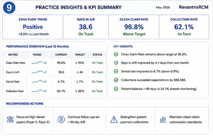
Practice Insights & KPI Summary Dashboard
What this dashboard communicates
Rolls all critical metrics (A/R, Days in A/R, denials, clean claims and collection %) into one executive overview. It provides clear, actionable recommendations to improve practice health.
And that’s not all—we provide complete visibility into your revenue cycle, with daily charge reporting, weekly denial and follow-up tracking, top payer performance, CARC code analysis, and detailed AR notes—so you always know what’s happening, what needs attention, and where your revenue stands.